Teen-created cover for Alexie's PART-TIME INDIAN
Editors Note on Feb 25, 2018: Please see my apology about promoting Alexie's work. --Debbie
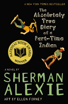
On the yalsa-bk listserv, a librarian in California wrote that some books are a hard sell to students because they have unattractive covers. Her example is Sherman Alexie's The Absolutely True Diary of a Part Time Indian. Here's the cover:
I love the cover. For me, it reflects the narrow way that a lot of Americans see American Indians. Not as people, but as toys in a cowboy and Indian context. But I am a Pueblo Indian woman. My perspective is different from, say, the students in Joy's library. One of her students created a new cover for the book. Here's the cover, available at Joy's wiki:
Cassie (another subscriber) says the book cover is great because the basketball and the geometry book speak directly to a teen reader, and that the necklace on the book "adds a touch of the unknown."
It would be interesting to find out which cover appeals to whom. I'm definitely going to ask my nephews on the reservation to tell me which one they'd pick up first... I'll let you know what they say.
What do you think? Which one do you prefer? Which one do you think teens would prefer?
__________
Update, 11:44 AM CST, June 8, 2011
Below are comments I receive on my facebook posts, and, by private email:
Martina, Dine (Navajo) said her teens picked up the book on their own last summer. The cover didn't turn them away. Their actions suggest they were drawn to the book because of the cover.
Susan in Oklahoma works with Creek, Euchee, and white students in their Summer Reading Program. She asked the group and says that they "all liked the original cover best."


7 comments:
I cannot say I am a big fan of the original cover. Not that I dislike it. But I don't know that teens would be immediately attracted to it because they cannot see enough of their world/lives in it -- or if simply it isn't visual enough. And the cover does not suggest the illustrations that are found inside the book, and which students often enjoy. I like the exercise, though, of having students design a new cover for the book they are reading.
Yeah---the illustrations inside are terrific, and, the cover doesn't look anything like them.
And yes---the creative act of designing a new book cover is a cool exercise.
The first cover pings very strongly as "literary fiction" to me, which is not a genre I'm a huge fan of as an adult and definitely not one I liked as a teen. The second cover reads much more as "YA" to me, but is a little too busy and garish (there's a necklace? I can barely distinguish it from the geometry book).
As a teenager I probably would have been more likely to pick up the second than the first. As an adult, I wouldn't pick up either if I weren't already familiar with Alexie.
The original cover is kind of cool - I like the use of the toys for precisely the reasons you mention, Debbie. BUT the way they are placed on the cover makes it hard to know what you're looking at - I *still* do a bit of a double-take when I see the cover, trying to sort out just what I'm seeing.
I like the student's design from a purely utilitarian perspective - it looks like it would appeal to younger readers (and that basketball is a clear and unmistakable hook for the apparently-elusive YA Boy Reader).
A fellow grad student has had her undergrads do the "design a cover" project [for "Rime of the Ancient Mariner," no less], and I thought it was cool but couldn't see it's application to what *I* do. Thanks to this post - I can see it, and I may even use it as an assignment in the future.
I think the original cover speaks directly to the dichotomy of straddling life between an "Indian" life and a "Cowboy" life. There is "war" within the single individual who lives in both worlds. The other cover is murky in meaning. Beautiful creation but a whole different story element.
I'd be more likely to pick up a cover based on the cartoons inside or one with a photo of Junior on the cover.
The problem with the first cover is it's trying to be too clever. It's showing what the book is not about, rather than what it is about. The context makes sense knowing the author and book, but people who know will pick up the book regardless of the cover, so they don't need anything special. It's missing a chance to attract readers who have no idea what the book is about.
The second cover wasn't professionally designed, so it'd be unfair to critique it as though it were... but I'd note they've picked elements that are in the book, rather than elements that aren't.
I asked 4 of our regular high school aged teens their preference between the two covers, 3 for the original and 1 no opinion. I then happened to see two young people who are part of a group that tours the country "teaching" native dance and culture and are currently teaching a high school summer class - I think something like "cultural ecology" in which they are using native materials including Fancing Dancing the movie. The comment of one was that the "new" cover is stereotypical of Indian representation using the basketball - they prefer the original. I personally as an older white librarian find the actual cover more striking because of the color. Thanks for asking - just wanted to pass on what I was able to gather today.
Post a Comment